HEINRICH KUEHN EMBROIDERY BOOKLETS
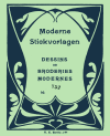
P-II003 Heinrich Kuehn – Moderne Stickvorlagen No. 752
Six patterns in black and grey shades, borders, corners, two cartouches and some small diamond motifs.
The alphabets are in two shades of blue. Four alphabets (three if lower / upper case are considered a single alphabet), two sets of numbers.
The black and grey patterns are identical to the (shades of red) patterns in P-II001 Moderne Stickvorlagen No. 749. The alphabets occor on other HKB booklets as well.
Small leporello, black and grey patterns printed on one side and blue alphabets on the other side.
Scans donated by Iva Innocenti, edited and charted by Sytske Wijnsma.
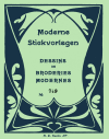
P-II001 Heinrich Kuehn – Moderne Stickvorlagen No. 749
Six patterns in dark and light red shades, borders, corners, two cartouches and some small diamond motifs.
The alphabets are in a single shade of blue. Three alphabets interspersed with small motifs of flowers, animals, houses, and people.
The red patterns are identical to the (black and grey) patterns in P-II003 Moderne Stickvorlagen No. 752. Some alphabets are identical to other HKB alphabets, but not all.
Small leporello, red patterns printed on one side and blue alphabets and small motifs on the other side.
Scans donated by Iva Innocenti, edited and charted by Sytske Wijnsma.
It’s when preparing publications like these that I remember a scene in Game of Thrones featuring a grey-dressed woman ringing a bell as she walks through a crowd.
Shame! Shame! Shame!
That applies to Heinrich Kuehn as well. Think of this: Two booklets, really close to each other in their series, and the patterns on side A, the colored patterns that should be the main selling point of these booklets, are identical. The page numbers are different, but the patterns themselves are not. The color in which they were printed is also different and that’s it.
I would take just one booklet and refer to the other as a blatant copy, except for the side B, which usually has the less interesting patterns. Those were different. Not unique because most of them are also found in other HKB booklets, but at least not equal to each other.
These two are part of a set of four acquired by Iva Innocenti. As they were bought together there must have been an earlier buyer who was sorely disappointed. I will admit to that as well. I like HKB and their patterns, and this mindless repeating of earlier publications is a letdown. If you were a publisher and ran out of designers or the designers ran out of creativity, surely you could just print more of one number? It’s not like the Workbasket where patterns are repeated after some fifteen or twenty years on the assumption that there are many new subscribers who haven’t seen the patterns yet and maybe the old subscribers have let their subscription lapse. These two were printed so close to each other that they must have been seen side by side.
Still, the individual patterns are nice and I like the side B patterns of P-II001.
FUNDRAISING
OUR USUAL FUNDRAISING CAMPAIGN WILL RUN FROM SEPTEMBER TO DECEMBER. OF COURSE DONATIONS ARE ALWAYS WELCOME.
IF YOU CAN’T AFFORD TO DONATE, BUT WOULD LIKE TO HELP THE ANTIQUE PATTERN LIBRARY, INTRODUCING THE LIBRARY TO PEOPLE WHO DON’T KNOW OF IT YET, IS VERY USEFUL, SINCE IT BROADENS OUR USER BASE AND THEREFORE ALSO OUR FUTURE DONOR BASE. BLOGS, TIKTOK, INSTAGRAM, PINTEREST, RAVELRY, FACEBOOK, OTHER SOCIAL MEDIA – SHOW OTHERS YOUR FAVORITE PUBLICATIONS AND WHAT YOU MADE USING THEM. OUR WORK IS ONLY USEFUL WHEN PEOPLE ACTUALLY USE IT!